dsh-theme-retro-press
andy-7-andy/dsh-theme-retro-press
Nine single-ink print palettes — sage linen, kraft paper, lead type, cyanotype, risograph, CRT tube, phosphor screen, punch card, floppy disk. Each palette carries its own paper grain, type pairing, corner shape, section rule and a whale mark redrawn in its ink, plus a letterpress pass (paper tooth, sheet mottle, ink bite) that can be switched off. Every palette ships separate light and dark tokens.
설치
dsh plugin --profile web add github:andy-7-andy/dsh-theme-retro-pressREADME
Retro Press
Nine palettes for the DeepSeek Harness Web client — a print shop and a row of old screens in the same drawer.
发版与上架流程见 docs/发布流程-RELEASE.md。
这是什么
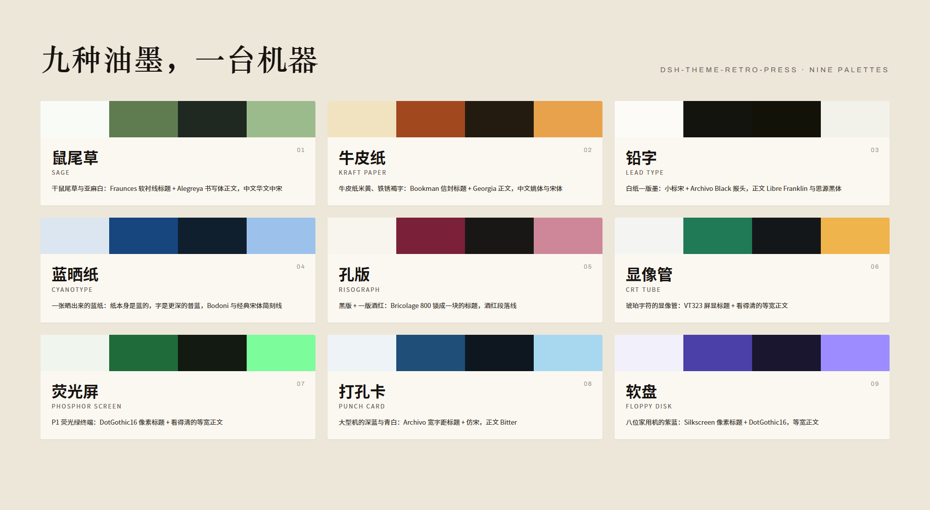
Retro Press 是一间开在 DeepSeek Harness 里的复古印制车间。九套配色,每一套都以一件实物命名——一束干鼠尾草、一张牛皮纸、一枚铅字、一张蓝晒纸、一版孔版油墨、一支显像管、一块荧光屏、一张打孔卡、一张软盘。
它不做"换个颜色"这件事。每套配色是一份完整的排印决定:标题用哪张脸、正文用哪张脸、中文和西文怎么配对、引文该不该换成仿宋、代码块该不该像终端。同一套排在浅色下是纸,在深色下是屏幕——两副面孔,同一份稿。
九套共用一条命名规则,所以并排看是一抽屉的版,而不是九个互相不认识的皮肤。
Nine palettes
| 配色 | Palette | 实物与排印 | |
|---|---|---|---|
| 1 | 鼠尾草 | Sage | 干鼠尾草与亚麻白:Fraunces 软衬线标题 + Alegreya 书写体正文,中文华文中宋 |
| 2 | 牛皮纸 | Kraft paper | 牛皮纸米黄、铁锈褐字:Bookman 信封标题 + Georgia 正文,中文姚体与宋体 |
| 3 | 铅字 | Lead type | 白纸一版墨:小标宋 + Archivo Black 报头,正文 Libre Franklin 与思源黑体 |
| 4 | 蓝晒纸 | Cyanotype | 一张晒出来的蓝纸:纸本身是蓝的,字是更深的普蓝,Bodoni 与经典宋体简刻线 |
| 5 | 孔版 | Risograph | 黑版 + 一版酒红:Bricolage 800 锁成一块的标题,酒红段落线 |
| 6 | 显像管 | CRT tube | 琥珀字符的显像管:VT323 屏显标题 + 看得清的等宽正文 |
| 7 | 荧光屏 | Phosphor screen | P1 荧光绿终端:DotGothic16 像素标题 + 看得清的等宽正文 |
| 8 | 打孔卡 | Punch card | 大型机的深蓝与青白:Archivo 宽字距标题 + 仿宋,正文 Bitter |
| 9 | 软盘 | Floppy disk | 八位家用机的紫蓝:Silkscreen 像素标题 + DotGothic16,等宽正文 |
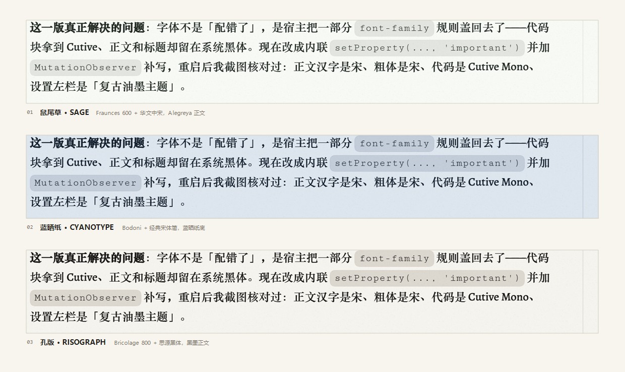
上面三张是应用里的截图,不是排好版的示意图:同一段文字,鼠尾草、蓝晒纸、孔版三种底色与字面。 行内代码是 Cutive Mono,粗体是各配色自己的正文族——字确实落到了正文节点上。
三种排印声音(细节)
配色只是底子,真正分开这三套的是排印。三套都按 13.5px 正文、1.75 行高排过,长段落读得下去,标题才敢做大。
- 铅字 —— 只有一种墨。标题小标宋 + Archivo Black,正文思源黑体 + Libre Franklin。没有第二色:链接、按钮、标记全用同一个墨色,浓淡只由字重和 2px 实墨段落线给出。
- 蓝晒纸 —— 纸本身就是蓝的:浅色是一张从显影液里捞出来的淡蓝纸、字是更深的普蓝;深色是还没干的那张,
#0A1E33到底。标题 Bodoni + 经典宋体简。 - 孔版 —— 黑版 + 一版酒红。Bricolage 800 把标题锁成一块墨,酒红只落在第二版该落的地方:3px 段落线、链接、按钮、标记的套印错位。
质感
配色定基调,下面每一项定质感,设置页里逐项切换,改动立即生效:
- 底纹 —— 纸纹像旧纸,扫描线像老显示器。
- 压印 —— 凸版印刷的三件事:纸有齿、纸不匀、字被压进纸里。随配色 / 平印 / 轻压 / 重压。铅字与孔版默认重压,鼠尾草、牛皮纸、蓝晒纸、打孔卡轻压,三套屏幕平印——屏幕不该有纸的齿。纸齿砖在 2× 屏幕上换用 320px 的那张(
@media (min-resolution: 2dppx)),颗粒的物理大小不变,只是不再被放大糊掉。 - 版心 —— 一行字排多宽:窄 600px(约 30 字)、标准 720px(约 40 字)、满宽。满屏长段落在 720px 上比拉到 1400px 好读得多。
- 形状 —— 圆润,或把卡片与按钮的圆角收成直角。
- 字体 —— 随配色,或强制衬线 / 标题衬线 / 等宽。
- 线条 —— 细线,或印刷的双细线(分隔线、表格、引用一起换)。
- 密度 —— 标准,或收紧段间距与列表间距。
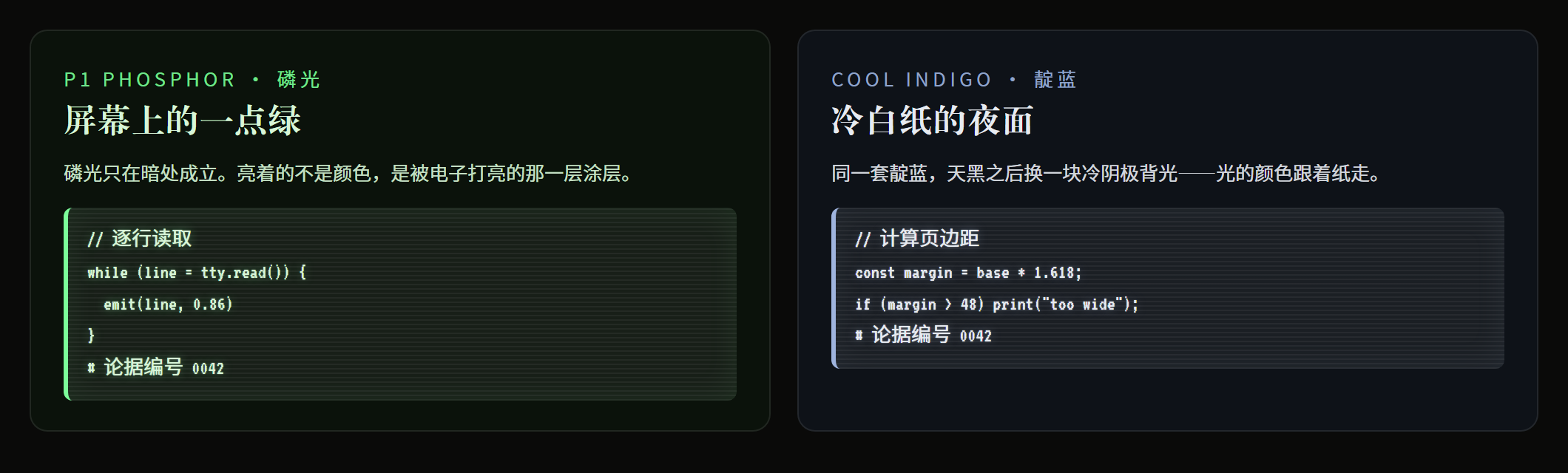
- 荧光 —— 只在深色模式:代码块带一层磷光与扫描线,像亮着的屏幕;浅色模式始终是纸。
- 动效 —— 印章呼吸闪烁;系统开了"减弱动效"时自动停。
- 品牌标记 —— 每套配色按自己的风格重绘鲸鱼标记,或退回原生图标。
第二色(品牌色)落在三处:h2 那一条段落线、表格表头的 9% 底纹、h3 前的一枚小方块——同一块油墨在版面上出现三次,不是只染一根线。
系统开了「提高对比度」时,纸齿层与墨晕会自动撤掉(prefers-contrast: more),字回到纯墨色;开了「减弱动效」时标记停止呼吸(prefers-reduced-motion: reduce)。
左平印、右压印(铅字重压 / 鼠尾草轻压):
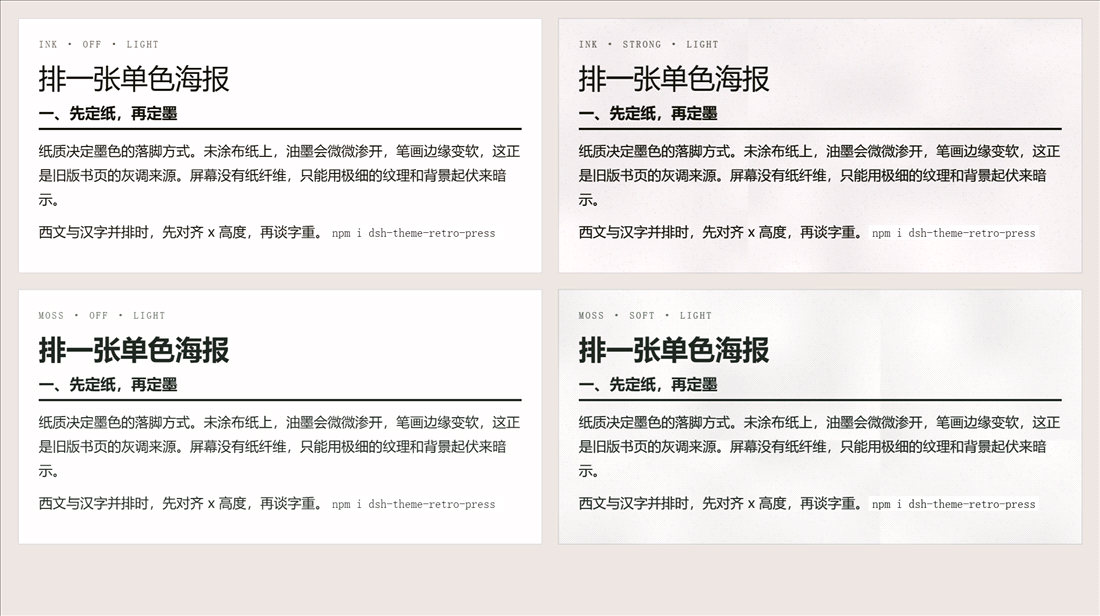
压印的强度可以逐套看:铅字与孔版是重压(标题有压痕、正文墨晕更厚),鼠尾草与牛皮纸是轻压。重压档同时给标题加 0.08px 描边,字口更"实",但小字号正文不动,长段落不会糊。
深色模式下的磷光层:
字体
西文全部随包。九套用到的 13 个拉丁字面(Fraunces、Alegreya、Archivo 400/700、Archivo Black、Libre Franklin、Playfair Display、Bricolage Grotesque、Space Grotesk、VT323、DotGothic16、Silkscreen、Bitter,加上等宽的 Cutive Mono)以 latin 子集 WOFF2 内嵌在 client.js 里,家族名带 RP 后缀,排在每个字体栈最前。不装任何字体、不联网,西文与数字都长同一个样。
汉字有一层随包的底线。方正小标宋、华文中宋、方正姚体、仿宋_GB2312、经典宋体简都是商业字库,不能随包分发,只能"引用 + 回退"。为了不让没装这些字库的机器掉进系统黑体,随包放了一份 思源宋体子集(Noto Serif SC,GB2312 一级 3755 字 + 标点 + 箭头 + ASCII,共 4239 字,1.32 MB WOFF2,保留 200–900 可变字重),族名 Song RP,排在每个中文字体栈的最后、通用族之前:本机装了方正小标宋就用方正小标宋,没装就落到这份宋体,不会出现豆腐块。缺点是这份底线是宋体,显像管/荧光屏/软盘在没有黑体的机器上会偏"书",但比换成系统黑体更接近主题。
| 角色 | 首选 | 回退 |
|---|---|---|
| 黑体(正文 / 标题) | 思源黑体 Source Han Sans SC | 微软雅黑 → PingFang SC → 等线 |
| 宋体标题 | 方正小标宋简体 | 华文中宋 → Noto Serif SC → 宋体 |
| 宋体正文 | 华文中宋 | STZhongsong → Songti SC |
| 经典宋体(蓝晒纸标题) | 经典宋体简 | 华文中宋 → Songti SC |
| 姚体(牛皮纸标题) | 方正姚体 | FZYaoti → 华文中宋 |
| 仿宋(打孔卡标题、引文) | 仿宋_GB2312 | 仿宋 → 华文仿宋 |
| 像素汉字(荧光屏、软盘) | DotGothic16 | 思源黑体 |
| 汉字底线(所有套) | 思源宋体子集 Song RP(随包) | 各栈前面的商业字库 → 系统宋体 |
| 西文标题(鼠尾草) | Fraunces | Playfair Display → Bodoni MT |
| 西文正文(鼠尾草) | Alegreya | EB Garamond → Archivo |
| 西文标题(牛皮纸) | Bookman Old Style | Bookman → Georgia |
| 西文正文(牛皮纸) | Georgia | Century Schoolbook → 华文中宋 |
| 西文标题(铅字) | Archivo Black | Archivo → Franklin Gothic Heavy |
| 西文正文(铅字) | Libre Franklin | Archivo → Franklin Gothic Book |
| 西文标题(蓝晒纸) | Bodoni MT | Playfair Display → 经典宋体简 |
| 西文正文(蓝晒纸) | Archivo | 思源黑体 → 微软雅黑 |
| 西文标题(孔版) | Bricolage Grotesque | Archivo → Franklin Gothic Medium |
| 西文正文(孔版) | Space Grotesk | 思源黑体 → 微软雅黑 |
| 西文标题(显像管) | VT323 | Share Tech Mono → Cutive Mono |
| 西文正文(显像管) | Cutive Mono | Courier Prime → 思源黑体 |
| 西文(荧光屏) | DotGothic16 / Cutive Mono | Courier Prime → 思源黑体 |
| 西文标题(打孔卡) | Archivo 700 | Libre Franklin → Franklin Gothic |
| 西文正文(打孔卡) | Bitter | Archivo → 思源黑体 |
| 西文标题(软盘) | Silkscreen | DotGothic16 → VT323 |
| 西文正文(软盘) | Cutive Mono | Courier Prime → 思源黑体 |
代码与等宽正文只有一张脸:所有配色的代码块、行内代码,以及显像管/荧光屏/软盘的正文,都用 Cutive Mono;VT323、Share Tech Mono、Courier Prime 只做标题,它们在 12.5px 上会掉笔画。这一枚字随包内嵌(
Cutive Mono RP,base64 TTF,78 kB),不需要另外安装。全部内嵌字面都是 SIL Open Font License 1.1,版权与许可证原文合并放在
assets/OFL-web-fonts.txt(Cutive Mono 与思源宋体子集另见assets/OFL-CutiveMono.txt与assets/OFL-NotoSerifSC.txt)。方正小标宋、方正姚体、华文中宋、经典宋体简、仿宋_GB2312 是商业字库,需要自行授权,主题只写名字不携带。
安装
dsh plugin add dsh-theme-retro-press
安装后重启 DSH,在 设置 → 复古主题 里选配色。
要求:DeepSeek Harness >= 0.2.0(engines.dsh),Web 客户端。
English
Retro Press is a printing workshop for the DeepSeek Harness Web client: nine palettes, each named after the physical object it is printed on — a bundle of dried sage, a kraft envelope, a piece of lead type, a cyanotype sheet, a risograph drum, a CRT tube, a phosphor screen, a punch card, a floppy disk.
Every palette is a complete typographic decision rather than a recolour: its own paper, rules, Latin–Han type pairing and a whale mark redrawn in its ink. The same palette is paper in daylight and a screen after dark.
Extras that come with every palette: paper grain or scanlines, square or rounded corners, hairline or double rules, compact or normal rhythm, forced type roles, a measure (600 / 720 / full width) for long paragraphs, a breathing seal, and — dark mode only — a phosphor glow with raster lines on code blocks. The grain tiles swap to a 320px version on 2× screens, so the tooth keeps its physical size instead of being upscaled. prefers-contrast: more drops the tooth and the ink bleed; prefers-reduced-motion: reduce stops the seal.
Three of them are single-ink editorial poster pages: Lead type (小标宋 + Archivo Black, no accent colour at all), Cyanotype (a Bodoni/经典宋体简 plate, Prussian blue in the dark) and Risograph (a Bricolage 800 block headline with one fluorescent pink second drum). Each changes the typographic voice, not just the hue.
Every Latin face above is bundled: latin-subset WOFF2 data URIs inside client.js, family names suffixed RP, first in each stack — so the nine palettes look identical on a machine with no fonts installed. They are SIL OFL 1.1; the licences travel with the package (assets/OFL-web-fonts.txt). The Han faces (方正小标宋, 方正姚体, 华文中宋, 经典宋体简, 仿宋_GB2312) are commercial and are referenced by name only — but the Chinese is not left to the system either: a Noto Serif SC subset (GB2312 level-1, 4239 glyphs, 1.32 MB, variable weight 200–900, family Song RP) ships inside the same file and sits last in every Han stack, so a machine without the commercial faces still gets a Song, not a tofu box nor an indifferent sans. Same licence file, plus assets/OFL-NotoSerifSC.txt.
License
MIT. The bundled Latin faces and the Noto Serif SC subset are SIL OFL 1.1 (see assets/); the commercial Han faces are referenced by name only and keep their own licences.