dsh-rightbar-max-keep-rail
nohappiness/dsh-rightbar-max-keep-rail
Changes the right sidebar panel-fullscreen mode to cover the conversation only: the panel starts at the left rail right edge instead of spanning the whole window, so the session list stays visible while the panel is maximized, and it keeps following the rail as you widen, collapse or drawer it.
Install
dsh plugin --profile web add github:nohappiness/dsh-rightbar-max-keep-railREADME
dsh-rightbar-max-keep-rail
把 DeepSeek Harness 右侧边栏的**「面板全屏」改成覆盖会话区、保留左侧会话列表栏**:全屏面板从左侧栏右缘开始铺到窗口右缘,不再连同会话列表一起盖住。
真 GUI(1440×900,先把插件注入的样式关掉、再打开,其余一切不动):
| 原生:全屏面板盖住左侧会话列表 | 装了本插件:全屏面板只覆盖会话区,左侧栏还在 |
|---|---|
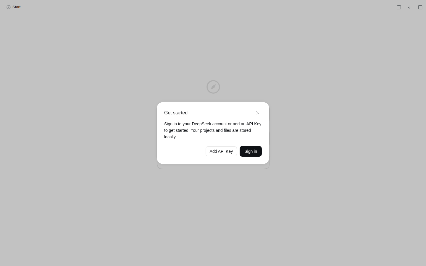 | 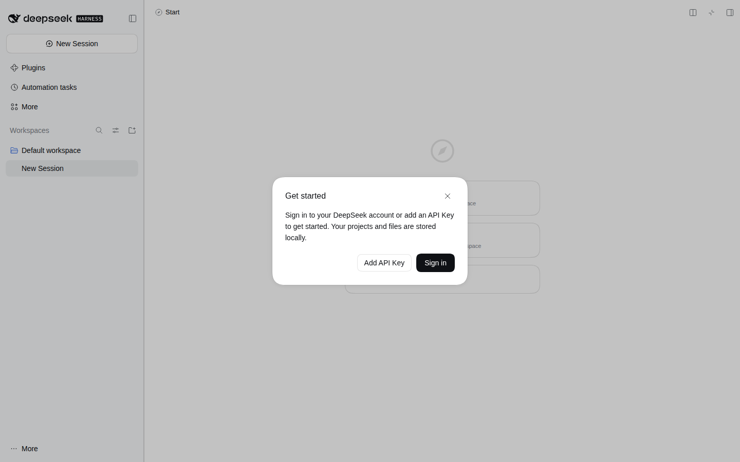 |
纯插件实现:不改 core 一行代码,浏览器半零依赖、零构建(lib/client.js 就是发布产物,不需要打包)。
一、问题:原生「面板全屏」是全窗口,不是会话区
右侧栏的「面板全屏」(词条 command.fullscreen = 面板全屏/退出全屏,快捷键命令 pane.fullscreen.toggle)在宿主里写死成 100vw:
| 证据 | 位置 | 内容 |
|---|---|---|
| 宽度与标记 | packages/client/ui-sidebar-right/src/client/shell/SidebarRight.tsx:342 | width: fullscreen ? '100vw' : width;'--dsh-sidebar-width': fullscreen ? '100vw' : ...;data-sidebar-right-panel={fullscreen ? 'fullscreen' : 'push'} |
| 定位 | .../shell/SidebarRight.module.css:31 | 面板是 position: absolute; top/right/bottom: 0,全屏时 --dsh-dockkit-dock-layer: 40(普通面板 20) |
| 唯一的例外 | .../shell/SidebarRight.module.css:93 | [data-windows-titlebar] .panel[data-sidebar-right-panel='fullscreen'] { max-width: calc(100vw - var(--dsh-windows-sidebar-width)) } |
| 那个变量是什么 | packages/client/ui-layout/src/client/AppFrame.tsx:294 | --dsh-windows-sidebar-width = cols.sidebar px = 左侧栏列宽 |
也就是说:「覆盖会话、保留左栏」正是 Windows 桌面端全屏的样子(它有一条 max-width 例外),而 Web 构建没有这条规则,全屏面板 100vw 把左侧栏一起盖住。本插件就是把这条规则搬到所有构建。
二、实现:一条样式 + 一次量宽
全屏面板宽度 = 100vw − 左侧栏宽
面板靠 right: 0 定位,减掉左栏宽之后自然从右侧往左铺,左缘正好落在会话列表栏的右缘——不推挤、不重排,左侧栏保持原样。
-
样式(
lib/client.js的CSS_TEXT,注入一份<style>):[data-sidebar-right-panel="fullscreen"] { width: calc(100vw - var(--dsh-keeprail-left, 0px)) !important; max-width: none !important; /* 盖掉 Windows 那条 max-width */ --dsh-sidebar-width: calc(100vw - var(--dsh-keeprail-left, 0px)) !important; }必须
!important:宿主的宽度与--dsh-sidebar-width都是内联写的(SidebarRight.tsx:342的style对象),普通样式表规则压不过内联声明。 -
量宽:
--dsh-keeprail-left写在<html>上,面板通过继承拿到。值来自 frame 网格第一列——grid-template-columns的计算值已经是解析后的 px 列表(AppFrame.tsx:294写入的「${cols.sidebar}px minmax(...) minmax(0, Npx)」),第一段就是左栏实际占宽。 -
跟随变化:左栏能被拖宽、被折叠、在窄屏变成抽屉(
data-sidebar-drawer),窗口也能改大小,所以全屏期间用requestAnimationFrame逐帧采样(每帧一次getComputedStyle,只在值变化时写变量);面板一消失就停。触发用MutationObserver只订四个属性:data-rightbar-fullscreen、data-sidebar-collapsed、data-sidebar-drawer(frame 上)、data-sidebar-right-panel(面板上)。 -
只认已发布的 DOM 契约:所有选择器都是
ui-sidebar-right/ui-layout的数据属性,没有一个 CSS-module 哈希类名。宿主若改了属性,插件退化成「什么都不做」,不会把界面弄坏。
折叠左栏与窄屏抽屉都算 0:这两种形态下左侧栏不占列(折叠无轨道、抽屉是浮层),留白反而是错的。
三、安装
dsh plugin --profile web add dsh-rightbar-max-keep-rail     # 装进当前 profile
# 或本地目录(开发时)
dsh plugin --profile web add /path/to/dsh-rightbar-max-keep-rail
装完重启 dsh(插件行在启动时装配)。用右侧边栏顶部那个「面板全屏」按钮进出全屏即可,按钮、快捷键、布局动画都还是原生那套。
四、验证
-
单元测试
npm test(11 条全过):cd dsh-rightbar-max-keep-rail && npm test -
真 GUI 端到端:在临时
DSH_HOME里dsh plugin --profile web add .→ 起实例 → 无头 Chromium 打开 GUI → 新建会话 → 开右侧栏 → 点「全屏」,然后在同一个页面里把插件注入的<style>置disabled再恢复,对比同一次全屏:状态 面板左缘 面板宽 视口 左栏轨道 --dsh-keeprail-left原生(样式关掉) 0 1440 1440 280px 280px 插件生效 280 1160 1440 280px 280px 再恢复 280 1160 1440 280px 280px 即全屏面板的左缘精确等于左栏右缘(280 = 280),宽度 = 视口 − 左栏;反复开关不残留布局。这一段同时证明浏览器半在真宿主里被加载并执行(
<style>存在、变量被写入、面板几何随之变化)。 -
浏览器夹具:
test/fixture.html按上面那两处 DOM 契约复刻了 frame 三列网格 +position:absolute; width:100vw的全屏面板,覆盖 GUI 里不方便手点的状态(拖宽左栏、折叠、窄屏抽屉、退出再进全屏)。夹具用无头 Chromium 按真实尺寸打开,插件按与宿主一致的方式从
window.__ModuleLoader__挂载,逐状态量面板矩形:python3 -m http.server 8793 --bind 127.0.0.1 # 在插件目录里 pw eval --width 1280 --height 800 --wait-for "#done" \ "http://127.0.0.1:8793/test/fixture.html" --js "document.getElementById('out').textContent"
1280×800 下实测(panelX = 面板左缘,gapToRail = 面板左缘 − 左栏右缘):
| 状态 | panelX | 面板宽 | 左栏宽 | gapToRail |
|---|---|---|---|---|
| 未装插件(原生) | 0 | 1280 | 264 | −264(盖住左栏) |
| 装上插件 | 264 | 1016 | 264 | 0 |
| 把左栏拖到 320 | 320 | 960 | 320 | 0 |
| 左栏折叠 | 0 | 1280 | 0(无轨道) | 0(不留白) |
| 左栏变抽屉(窄屏) | 0 | 1280 | 0(浮层) | 0(不留白) |
| 退出全屏 | 860 | 420 | 264 | —(回到原生内联宽度) |
| 再进全屏 | 264 | 1016 | 264 | 0 |
1024×720 复测同一组数字按比例成立(264/760、320/704),页面无 console 报错。
五、已知限制(诚实清单)
- 宿主改属性即失效:面板靠
data-sidebar-right-panel="fullscreen"认,frame 靠data-rightbar-fullscreen认。0.2.2-rc.1实测存在;将来改名则插件静默不生效(不会报错、不会破坏布局)。 max-width: none是覆盖性的:它盖掉 Windows 桌面端那条max-width。宽度已经算成「视口 − 左栏」,再让一次会窄一截,所以这里选择不重叠。- 移动端:窄屏下自动化全屏由视口宽度推导,左栏此时是抽屉,插件算出 0,行为与原生一致(覆盖全屏)——这不是 bug,是没有左栏可保留。
- 未接真实模型会话:真 GUI 端到端用的是空会话(没登录、没有 API Key),只验证布局与插件装载;对话流式过程中反复进出全屏只由 rAF 采样保证跟随,没有在长会话里压测过。
文档修订记录
| 日期 | 修订 |
|---|---|
| 2026-11-12 | 0.1.1:截图改为 screenshot-<序号>-<说明>.png 命名并补 screenshots.json(按顺序列出两张展示图,供插件市场与 awesome-dsh-plugin 收录展示)。代码未变。 |
| 2026-11-11 | 0.1.0:首版。全屏面板宽度改为「100vw − 左栏宽」,rAF 采样跟随左栏拖动/折叠/抽屉;11 条单测、真 GUI 端到端(280/1160 对 0/1440)、无头 Chromium 夹具量像素全部通过。 |
License
MIT
Related plugins
dsh-web (dsh-task-board)
zhu1090093659/dsh-web
dsh-web (dsh-web-all)
zhu1090093659/dsh-web
dsh-TUI
ccch1mneyyy/dsh-tui
dsh-web-ui (dsh-task-board)
zhu1090093659/dsh-web-ui