dsh-hero-theme
lhy723/dsh-hero-theme
HeroUI v3 theme builder for DeepSeek Harness Web and Desktop: live Accent hue, Base tint, font family, radius, form radius and light/dark controls, applied as one token-override layer with HeroUI Slider, Tabs and Select.
Установка
dsh plugin --profile web add github:lhy723/dsh-hero-themeREADME
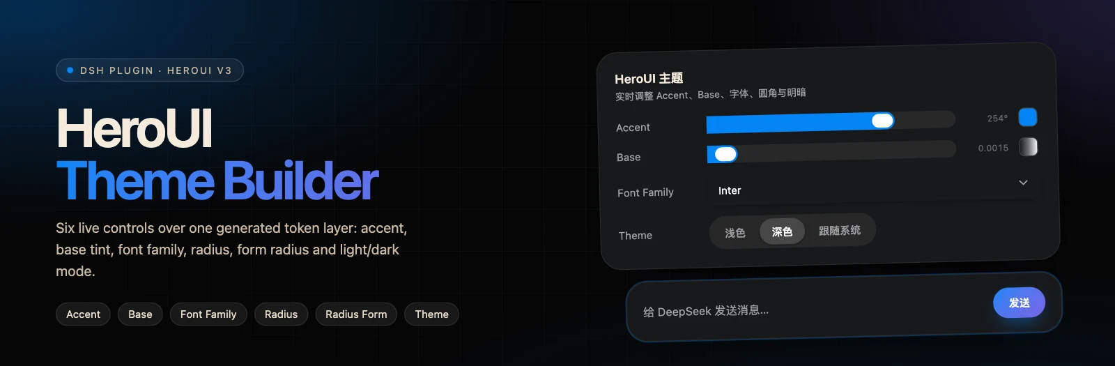







dsh-hero-theme
A HeroUI v3 theme builder for DeepSeek Harness Web and the embedded Desktop workspace.
Six live controls regenerate the complete DSH token layer — no rebuild, no profile restart.
English · 中文
Preview
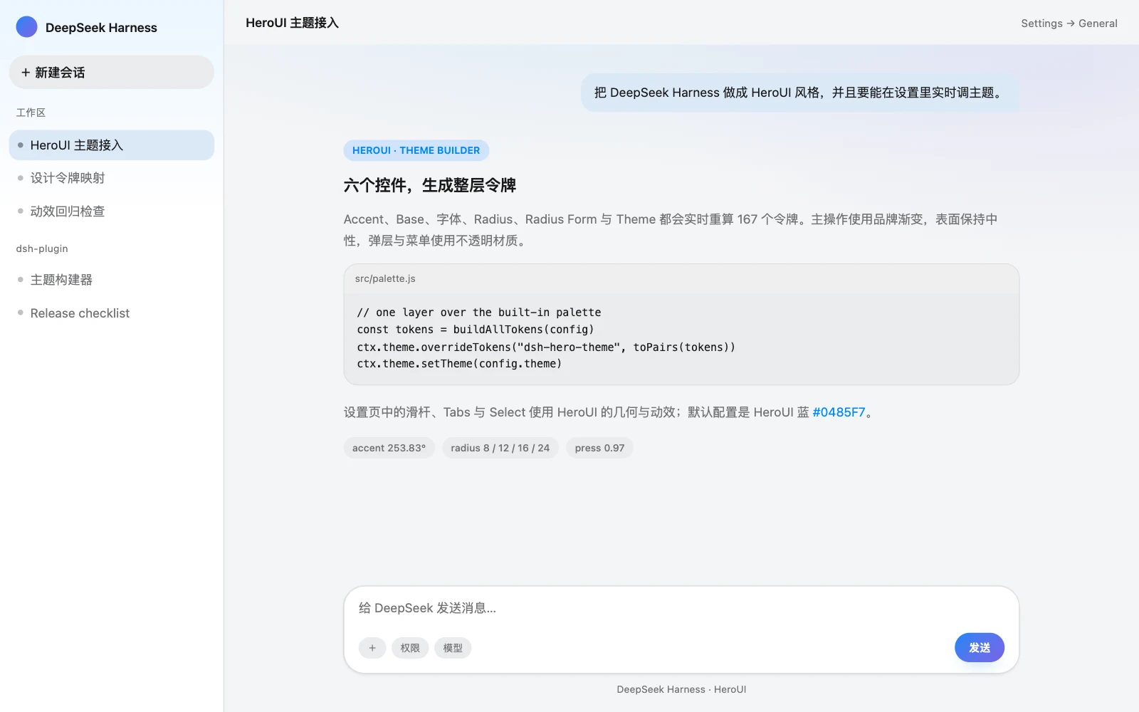
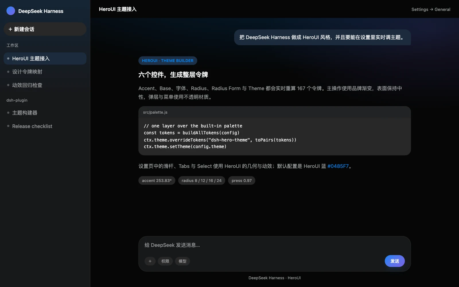
Preview renders of the generated light and dark palettes in a representative DSH layout.
Highlights
| Six live controls | Accent hue, Base chroma, Font Family, Radius, Radius Form, Light / Dark / System. |
| 167 tokens × 2 schemes | Every alias, specific, Shiki, radius, shadow and timing token is regenerated from the config. |
| HeroUI builder formulas | Accent oklch(62.04% 0.195 hue), neutral chroma scaling, semantic hue rotation, radius scale. |
| Component geometry | HeroUI Slider, Tabs, Select, Button, MenuSurface, Dialog and Tooltip geometry plus enter/exit motion. |
| No rebuild loop | Changes apply through one ctx.theme.overrideTokens() layer and persist to the profile Cordis patch. |
| Reduced motion aware | All added transitions and enter/exit animations stop under prefers-reduced-motion: reduce. |
Theme builder
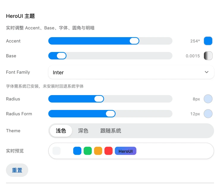
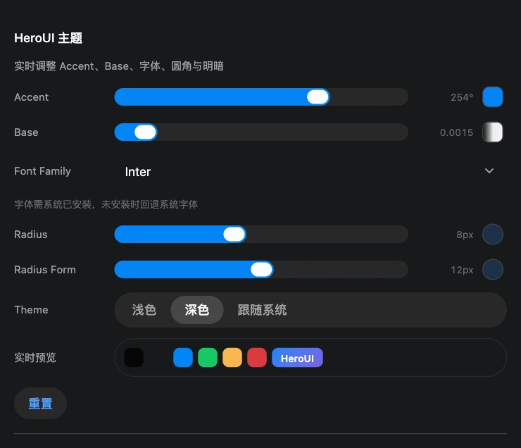
Settings → General → HeroUI theme. The sliders, Tabs and Select are HeroUI-styled controls.
| Control | Range | Default | What it changes |
|---|---|---|---|
| Accent | hue 0–360 | 253.83 | Accent oklch(62.04% 0.195 hue) (#0485F7 at the default), focus ring, gradient start |
| Base | chroma 0–0.02 | 0.0015 | Chroma of every neutral (background, surfaces, text, borders) |
| Font Family | Inter / System UI / Geist / Manrope / IBM Plex Sans / JetBrains Mono | Inter | --dsw-font-family and the brand stack |
| Radius | 0–1.25rem | 0.5rem (8px) | HeroUI radius scale and card radius (3×) |
| Radius Form | 0–1.5rem | 0.75rem (12px) | Inputs and form fields |
| Theme | Light / Dark / System | Dark | Base color scheme and ctx.theme.setTheme() |
The default accent is HeroUI blue #0485F7 at hue 253.83; the secondary gradient color is generated 31.67° around the wheel toward the HeroUI violet. Fonts must be installed locally — the stack falls back to System UI.
Generated palette
The generator mirrors the HeroUI v3 theme builder formulas:
| Token | Light | Dark |
|---|---|---|
| background | oklch(97.02% base hue) | oklch(12.00% base hue) |
| foreground | oklch(21.03% base hue) | oklch(99.11% base hue) |
| surface | oklch(100% 0.53×base hue) | oklch(21.03% 2×base hue) |
| surface-secondary | oklch(95.24% 0.8×base hue) | oklch(25.70% 1.53×base hue) |
| accent | oklch(62.04% 0.195 hue) | same |
| success / warning / danger | HeroUI semantic hues, rotated by 12% of the accent hue delta | same |
Radii: HeroUI component tokens use 3× (cards), 2.5× (tabs), 2× + 6px (popovers) and a separate form radius. DSH's semantic scale is xs 0.5× / sm 1× / md 1.5× / lg 2× / xl-panel 3×, so native rows, menus and cards keep their intended proportions.
Brand layer
On top of the generated tokens, src/hero.css adds the recognizable HeroUI details:
- Gradient primary actions — accent →
accent + 31.67°(blue → violet at the default) with a soft glow. - Aurora wash — accent/violet gradients on the conversation canvas and sidebar.
- HeroUI surfaces — composer and dialogs use the card radius; Dropdown/Select menu popovers use the 22px dropdown radius. Bubbles, selected sessions, menus and overlays never show the page through.
- HeroUI controls — 36px secondary buttons with the 0.97 press scale, a sliding-indicator Tabs switch for the theme, and a Select with a rotating chevron, 150ms scale/fade popover, 100ms exit and a stroke-drawn check.
- HeroUI sliders — 20px track with 12px end caps, a 28×20 accent thumb and a 24×16 inner face; an invisible native range input keeps pointer, keyboard and aria semantics.
- Motion — button
scale(0.97), popover/dialog/tooltip enter scales, 2s skeleton shimmer, user-message entrance; all disabled underprefers-reduced-motion.
Install
# DSH Web
dsh plugin --profile web add dsh-hero-theme
# DSH Desktop
dsh plugin --profile desktop add dsh-hero-theme
Or install manually into the Web profile:
cd ~/.dsh/profiles/web
pnpm add dsh-hero-theme
Add "dsh-hero-theme" to dsh.profile.bundles in that profile's
package.json and restart the profile.
Then open Settings → General → HeroUI theme. Drag Accent/Base/Radius/Radius Form, choose a font and theme; every change applies immediately and is saved into the active profile's Cordis patch. Reset returns to the builder defaults.
How it works
flowchart LR
  A[Profile Config<br/>6 volatile fields] --> B[src/palette.js]
  B --> C[167 tokens<br/>light + dark]
  C --> D[ctx.theme.overrideTokens]
  D --> E[DSH Web / Desktop UI]
- The Host declares six volatile Config fields:
theme,accentHue,baseChroma,fontFamily,radius,fieldRadius. - The browser half reads that config and calls
buildAllTokens()to generate both light and dark palettes. - The result is applied as one
ctx.theme.overrideTokens()layer;ctx.theme.setTheme(config.theme)switches the built-in base scheme. - The settings row writes each field through ConfigForms (range writes are debounced by 180ms).
- An external change to the built-in Appearance row is adopted into
theme, so reloads keep the same appearance.
The override disposer is deferred with queueMicrotask so removing the layer never re-enters the theme/change dispatch.
Platform compatibility
dsh-hero-theme is a Web client plugin (dsh.client.platform: "web"). DSH Desktop embeds the Web application, so the theme applies there through the Web client plugin loader; Desktop has its own profile. This package styles the embedded workspace only — it does not add native menu, tray, or window-shell UI.
Requires DSH ^0.2.2-rc.1.
Develop
npm run build   # regenerates lib/client.js + lib/index.js
npm run check   # build, syntax, API contract, palette and contrast checks
src/palette.js is the single source of truth for colors, radii and fonts. It is injected into the client bundle at build time; its default output is covered by contrast and token-set checks.
Repository layout
dsh-hero-theme/
├── package.json          # dsh.bundle.patch + dsh.client manifest
├── cordis.patch.yml      # loader entry insert (id: dsh-hero-theme)
├── src/
│   ├── index.js          # Host Config schema (six volatile fields)
│   ├── palette.js        # HeroUI v3 palette generator
│   ├── client.tpl.js     # browser half: builder row + token application
│   └── hero.css          # brand gradient, aurora, opaque surfaces, motion
├── scripts/
│   ├── build.mjs         # zero-dependency build
│   └── check-compat.mjs  # DSH API, palette, contrast and CSS contract
├── .github/asset/        # README banner and preview renders
├── LICENSES/             # Apache-2.0 text for the HeroUI-derived material
└── lib/                  # generated artifacts (rebuilt on install/pack)
Attribution and license
The plugin code is MIT-licensed (see LICENSE). Design tokens and interaction values are derived from HeroUI, which is Apache-2.0 licensed; see NOTICE and LICENSES/Apache-2.0.txt.
This is an independent theme. It is not affiliated with or endorsed by HeroUI.
Похожие плагины
dsh-wallpaper-engine
elysia395/dsh-wallpaper-engine
dsh-deep-whale (maid-atelier)
small-tailqwq/dsh-deep-whale
dsh-deep-whale
small-tailqwq/dsh-deep-whale
dsh-claude-style
nwflower/dsh-claude-style