dsh-glass-theme
ayelsh/dsh-glass-theme
Apple Liquid Glass 皮肤:重写 Harness 的整套设计 token,并自带设置页面、带峰谷时段标记的分组模型选择器和合并后的用量面板。
安装
dsh plugin --profile web add github:ayelsh/dsh-glass-themeREADME
dsh-glass-theme
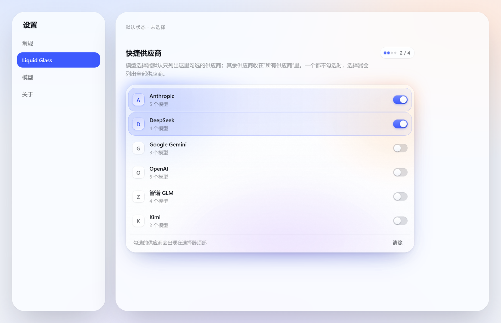
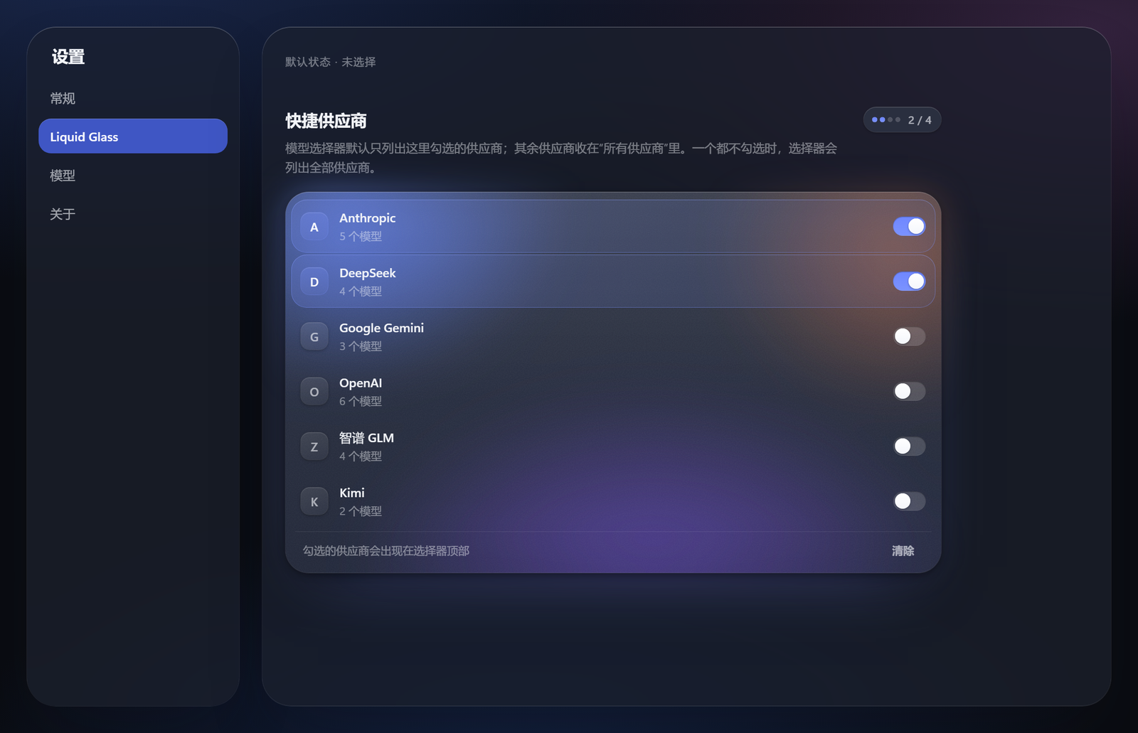
An Apple Liquid Glass skin for the DeepSeek Harness Web GUI. Every surface in the app is redrawn: floating glass chrome over an ambient light field, an opaque reading surface for the transcript, and one material ladder shared by every panel, popover and dialog.
Pure CSS plus a ~150-line client runtime. Nothing in the shipped app is patched; the skin loads as an ordinary Harness bundle and layers its stylesheets after the app's own.
| Light | Dark |
|---|---|
 |  |
What it does
- Re-keys the app's whole token vocabulary. The shipped theme publishes an
empty token set, so the palette is CSS-only.
src/css/tokens.cssre-declares ~250--dsw-*custom properties onbody(andbody[data-ds-dark-theme]), which makes every page the skin has never heard of inherit the redesign. It also defines 11 properties the shipped build consumes but never defines. - Redraws every surface across 15 sheets: shell, sidebar, conversation, composer, overlays, model, picker, stats, settings, pages, widgets, motion.
- Replaces the composer's model picker.
src/picker.jsmounts its own React card intoconversation.input.modeland hides the host trigger: grouped providers, a one-line description per model, the reseller price ratio as a badge, a live peak/off-peak chip that follows the SELECTED model's provider (DeepSeek: 工作日 9:00–12:00 + 14:00–18:00, ≈2×; 智谱: 工作日 14:00–18:00, ≈2×; providers without a schedule show no chip), and an inline effort segmented control beside the model list (both visible at once; picking a model keeps the card open). Configured providers narrow the default list; everything else stays behind one "所有供应商" row. - Merges the usage readouts.
src/stats.jsreplaces the two stat pills and the context ring with one control that opens a single panel: context pressure and its three buckets, session timings, and the token ledger. The pill sits at the input box's right edge and the panel hangs off that same right edge. - Adds its own settings page (
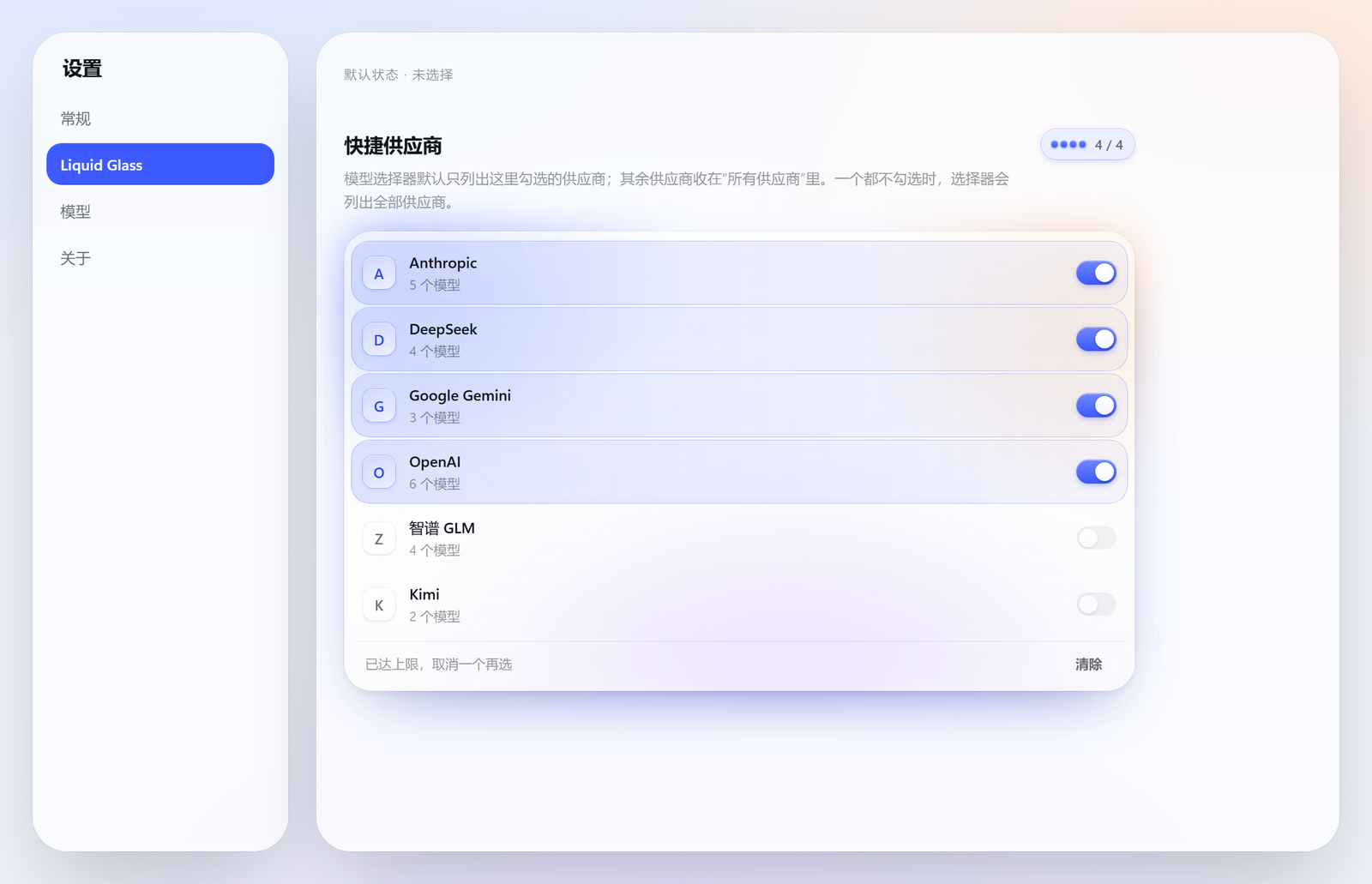
settings.section, "Liquid Glass") where the quick-provider list is chosen. The page has one material object — a frosted board lit from inside by its own light field (the settings sheet is already glass; a second card would be glass on glass) — with a capacity meter, glyph tiles, staggered entrance, and etched grain that answersprefers-reduced-transparency. - Answers the accessibility questions:
prefers-reduced-transparency,prefers-contrast,prefers-reduced-motion,hover: none, and keyboard-only focus rings (gated on input modality, so a pointer user never sees one). - Styles foreign pages. Third-party plugins render unclassed HTML into the
mainslot; those controls get the app's type and control scale too, without reaching into markdown output.
Install
lib/ is committed, so a clone is ready to load — installing needs no build step.
The releases page carries
the same build as a prebuilt tarball,
dsh-glass-theme.tgz.
Its name is version-free on purpose, so that URL keeps resolving across
releases; storefronts serve it instead of a build-from-source command.
-
Copy the package into your profile's
node_modules:cp -r . ~/.dsh/profiles/desktop/node_modules/dsh-glass-theme -
Add it to that profile's bundle list in
<profile>/package.json:{ "dsh": { "profile": { "bundles": ["dsh-glass-theme"] } } } -
Restart the Harness.
The restart is not optional: the plugin roster is composed from the profile before the window opens, and the host half (routes, peak-rate cache, usage ledger) is mounted at boot. Nothing in the shipped app is modified — removing the folder and the bundle entry restores the stock interface exactly.
Layout
src/css/               the 15 stylesheets, in cascade order
src/client.js          mounts the sheets, tracks modality, wires the layers
src/catalog.js         the model catalogue: providers, families, descriptions, pricing
src/picker.js          the ported model picker (React, mounted into the model slot)
src/stats.js           the merged context/usage panel
src/settings-section.js the skin's settings page
src/host/              the host half: routes, peak-rate catalogue, usage ledger
lib/client.js          build output (generated)
lib/host/              build output of src/host (generated)
vendor/                the reference package's data files and assets (MIT, see LICENSE-reference.txt)
tools/                 build + verification tooling
Build and verify
node tools/verify.mjs       # every selector must resolve against the shipped build
node tools/leak.mjs         # [class*=] must not over-match sibling locals
node tools/build.mjs        # inlines src/css/*.css into lib/client.js, copies the host half
node tools/smoke.mjs        # evaluates the bundle against a stubbed DOM
node tools/assert-built.mjs # the authored rules actually survived into lib/client.js
node tools/host-check.mjs   # the host half registers its routes without throwing
Live probes (each needs the GUI running; they mint their own auth cookie):
node tools/two-level.mjs                # the picker's three states: unconfigured, configured, the second card
node tools/settings-page.mjs            # the skin's settings page renders, lists providers, and its switches write
node tools/pick-check.mjs               # one row checked, across providers that share a model id
node tools/effort3.mjs                  # the effort segment applies a level
node tools/picker-rows.mjs              # fail if any row lacks a description or its ratio badge is block-level
node tools/chk-chip.mjs                 # the peak/off-peak chip's state and countdown
node tools/meter.mjs --shot G:/tmp/m    # the context meter panel
node tools/stats-dom.mjs --theme light  # the two stat dialogs
node tools/rail.mjs --scan              # the turn rail's hover previews
verify.mjs is the important one. A skin is nothing but selectors, so a wrong
hash prefix or a renamed local is a silently dead rule — no error, no warning,
just a surface that keeps its old look. The tool resolves every token against
research/shipped-class-map.json (extracted from the installed app) and fails
the build on a miss.
The inventories verify.mjs resolves against
The app generates its CSS-module class names (_local_hash), so the only honest
way to check a selector is against the classes the installed build emits. Those
maps are generated, not committed — they contain the app's own stylesheet text,
which is not ours to redistribute. One step each:
node tools/extract-inventories.mjs --asar "<install>/resources/app.asar"      # shipped classes + attributes
node tools/foreign-inventory.mjs --root ~/.dsh/profiles/desktop/node_modules  # installed plugin classes
Both write into ../research/ — one level above the package, so an installed
copy never carries them. extract-inventories.mjs auto-detects a local install
when --asar is omitted.
assert-built.mjs exists because the bundle escapes its own CSS: each sheet is
embedded as a JSON string, so a newline is the two characters \ n. A regex
written against the source file misses in the bundle for that reason alone —
which looks exactly like a lost rule. The tool unescapes once and then asserts
both the rules that must exist and the ones that must not.
Design rules the sheets follow
- A page is a reading surface; a control is glass. The transcript column is opaque on purpose — text that scrolls must never sit on a moving blur. It picks up the room's light direction through a very low-alpha gradient instead.
- One ladder. Menus are L2, sheets and dialogs are L3, toasts float. Nothing stacks more than two backdrop layers, and nothing is glass on glass.
- Large glass gets more fill and less saturation. A 640px dock at 180% saturation turns the ambient field's chroma into a purple wash; the same material at 140% reads as glass.
- A floating layer earns its float from its own rim. Over an opaque surface there is nothing to blur, so the 0.5px lit top edge and hairline do the work.
- Know what to leave alone. The app's scrollbars, delete-button styling and inline-styled third-party controls are already correct; the skin does not restyle them.
- Never style a control by its ARIA role alone. The role lands on whatever
element receives the click, not on the painted shape.
role="switch"sits on an 88×20 toolbar button in the shipped app and on a 530×70 full-width row indsh-zhipu-plan; a generic rule painted those rows as accent capsules that swallowed their own labels. Style a control when its own class says what it is, and let a plugin's own design stand when it does not. - A list row is a member of its group, not a card in it. When a section header already says "these belong together", a plate behind every row redraws the group once per row — it is the same statement repeated N times, and it eats the row's own horizontal room. Reserve plates for lists of independent cards (schedules, goals); for a grouped list use the header, the whitespace and one state signal per row.
- A state signal goes on the thing that changes state. The running job row is told apart by a tinted command and the primitive's spinner, not by a background — a fill would make "running" a surface, which it is not, and would leave nothing louder for the row that is actually selected.
- Inline styles win, so measure before believing. The shipped
StateDotsetswidth/heightinline and renders an SVG spinner forongoingbut a::afterdot for every other state. A skin rule cannot resize it, and a fixture that hand-writes the markup will happily "prove" a bug that the app does not have. Copy the real markup into the fixture, then measure. - A class can name a modifier, not an element.
xpvNua_fadeTopis not an overlay drawn over the turn rail's ends — it is added to the same div that carriesxpvNua_scroller, so it IS the scroll container. Styling it as if it were a separate overlay (pointer-events: none) disabled every mark inside the rail: it still scrolled, still looked right, and could not be clicked or previewed. Read the markup before styling a name. - A shared primitive can reach across sheets.
[role='tooltip']is the right hook for tooltips and also matches the turn rail's hover preview, which is arole="tooltip"reading card that brings its own material. The generic rule cropped it to a 9px radius and a 4px inset. Scope a primitive with:not([class~='…'])— and use~=there, since a*=guard over-matches the card's own child classes. - Inject beside a flex column and it becomes a block.
OptionCopyisflex-direction: column, so appending the multiplier badge as a sibling of the model name stretched it to the full row width — a 300px grey bar under every name. The badge had to go INSIDE the name span. When a decorator adds nodes to someone else's React tree, the parent's layout mode decides what the node becomes; put it where its shape is already correct. - A wrapping flex row is not a grid. Six provider chips broke 5+1 across
two lines, which reads as a mistake and costs the same height a balanced 3+3
does.
grid-template-columns: repeat(3, minmax(0, 1fr))gives equal cells, so the row scans as one control and every chip is the same target size. - A number needs a reason, not just a state. 空闲 at 10:00 on a Wednesday
and 空闲 on 国庆 are different facts, and a weekday-only rule is wrong on the
~dozen days a year the reader is most likely to check. The price chip carries
data-lg-reason(法定节假日 / 周末 / absent) so a holiday reads as a holiday rather than as a clock that stopped. A year with no holiday table falls back to the weekday rule instead of claiming accuracy it does not have. - A card that renders is not a card that works. A portal mounts outside the
React tree, a handler can be lost in a port, and
select()can reject while the trigger keeps showing the old model — all invisible in a screenshot.tools/picker-select.mjsdrives a real mouse, asserts the label changed, and then puts the model back, because a probe that leaves the user on a different model has done damage, not measurement. It reads a row's name from its own text nodes: the name span also carries the multiplier badge, so an exact match against the trigger label would never hit. - A host half is untested until it has been applied.
apply()only runs at GUI start, and a throw there can take the whole app down — but the GUI under test is the one serving the conversation, so "restart and see" is not a test.tools/host-check.mjsruns the realapply(ctx)against a recording stub and asserts the routes it registers; it is what turns a launch-time crash into a line of output. - A service must be declared before it can be used.
ctx.slotsis only an accessor when the bundle exports it ininject; withoutinject: ['slots']the call throws inside atry, the page never appears, and nothing is logged where a user would look. A slot's owninjectis an INJECTOR FUNCTION, not a list — an array registers a section that renders nothing and reports nothing. - An entry at the end of a scroll is an entry most users never see. The effort row and the "所有供应商" door were rows inside the scrolling body, so they sat ~1300px below the viewport once a 28-model provider was listed. They moved into a footer outside the scroll area: a control is not the last row of a table.
- A projection is not the store.
projections.faceOf('modelSelection')returns a flattened summary with nogroups; the provider list only exists onctx.get('modelDirectories').directoryFor(session).store.getSnapshot(). The picker already read it the second way, which is why the composer showed six providers while the settings page showed none.